(a) The choice of font
From the perspective of art, the font itself can be seen as an art form. It has a great influence on people in terms of personality and emotion. In graphic design, the processing of the font is as critical as the processing of other design elements such as colors, layouts, graphics, and so on.
Different fonts have different modeling characteristics. Some are beautiful, some beautiful, some regular, some eye-catching, some free uninhibited, some cheerful and light, some vigorous and simple ... for different content should choose a different font, using different font characteristics to reflect the specific Content. For example, headline texts are more eye-catching, clearer, and more concise, such as black body, arts, etc. At the same time, different fonts in the entire layout form different strengths and weaknesses and contrasts between different realities.
Among the font elements, the selection and collocation of fonts and fonts are very particular. The process of choosing the font style is a process of aesthetic judgment. The design and selection of the font are the basis of the layout design. The commonly used fonts in Chinese include Song, Body, Black, and Four. In order to achieve eye-catching results in the title, there have been bold, body art, amber body, thick round body, fine round body and hand-painted creative art characters. In typographic design, choose two or three fonts for best visual results. Otherwise, it will make people feel confused and lack overall results. Among the three fonts selected, bold, thin, elongated, flattened, or adjusted line spacing can be considered to change the font size, which can also produce rich and colorful visual effects.
Graphic designers can use fonts to more fully reflect the emotions in the design. Font selection is a perceptual and intuitive behavior. However, no matter what font you choose, you have to rely on the overall design of the graphic design and the needs of the reader. For example: bold characters strong and powerful, with male characteristics, suitable for machinery, construction and other content; fine body words elegant and meticulous, there are female characteristics, more suitable for clothing, cosmetics, food and other industries. In the same plane, the type of fonts is less, the layout is elegant, and there is a sense of stability; when there are many types of fonts, the layout is active and colorful. The key is how to grasp this proportional relationship based on the plane content.
(B) kerning and line spacing
The grasp of kerning and line spacing is the designer's psychological feeling of the layout, and it is also a direct reflection of the designer's design taste. The normal proportion of general line spacing should be: 10:12, that is, using the word 10 points, then the line spacing 12 points. This is mainly due to the following considerations: Appropriate line spacing will form a clear horizontal blank band to guide the viewer's gaze, and too wide line spacing will make a line of text lose good continuity. In addition to the effect on readability, the line spacing itself is also a very expressive design language. In order to enhance the decorative effect of typography, it is possible to consciously widen or narrow the line spacing, reflecting the unique aesthetic interest. But for some special layouts, the widening or narrowing of kerning and line spacing can better reflect the content of the theme. For example, widening the line spacing can reflect a relaxed and stretched mood, and it is appropriate to apply entertainment and lyric content. In addition, by carefully arranging the wide and narrow line spacing, the spatial level and elasticity of the layout can be enhanced and the unique ingenuity can be exhibited. In the modern international fashion, the arrangement of words is arranged separately, making people feel fresh and modern. Therefore, kerning and line spacing are not absolute and should be based on actual conditions.
(3) The area of ​​text
In the plane, the text is usually area-based, that is, the text in the screen is arranged according to the number and content of the program units. Through the change of the size of the text area, the characters are formed in a combination of unequal size and area, so that the text part of the screen appears elastic point, line, surface layout, thereby creating a compact, comfortable and other different effects for the arrangement of the layout. It can reduce readers' reading burden and increase reading interest. At the same time, it can make the layout of the plane produce rhythm, rhythm and visual impact. By adjusting the font, kerning, line spacing, etc., adjust the characteristics of the entire text block surface, making it tight and sometimes sparse.
The layout of the text should also pay attention to the formatting effect of the text itself. In the text picture composition, the text content of different key points is expressed in different fonts, which is commonly used in the design, such as the emphasis on the first line, the emphasis on citations, and so on. However, too many fonts appear to be unsettled, and fonts are too few and lack the necessary anger. The number of fonts often implies the amount of core content in the design plane.
Third, the principle of text design in graphic design
(I) Improve the readability of text
The main function of the text is to convey the author's intentions and various information to the public in visual communication. To achieve this goal, the overall appeal effect of the text must be considered in order to give a clear visual impression. Therefore, the design of the text should avoid confusion, easy to understand, easy to understand, do not design for the design, forget the basic purpose of the text design is to better, more effective communication of the author's intentions, express the theme of the design and Conception ideas. Therefore, in the design, we must choose the appropriate font, font size, pay attention to the visual order and direction of the text in the browse, and treat the words and words that need to be highlighted. For poorly readable fonts, you can increase the area to make it more clear.
(II) Coordinating the overall style of the text style and the plane
Every flat artwork has its own unique style. Under this premise, the combination of different fonts on a single page of a work must have a tendency to conform to the style of the entire work, form an overall mood and emotional tendency, and it is not possible to create a style for all kinds of writing. . Therefore, based on the correct choice of fonts, it is sometimes necessary to “textualize†the main texts, that is, to make the text strokes reasonably distorted and matched, and to emphasize the structural beauty of the font itself and the beauty of strokes.
(c) The location of the text should meet the overall requirements
In graphic design, texts have a sense of size, weight, strength and weakness. Their position on the screen directly affects the overall effect. To deal with the positional relationship between text and text, the positional relationship between text and graphics. In a picture layout, the combination of words should be relatively concentrated. If the picture is the main appeal factor, the words should be arranged in a compact place in an appropriate position, and they should not be over-dispersed so as not to disturb the flow of sight due to the unclear subject.
No matter what kind of visual media, text and pictures are its two major components. The combination of text arrangement directly affects the visual communication effect of the layout. Therefore, the design of text in the layout is to enhance the visual communication effect, enhance the appeal of the work, and give an important content of the aesthetic value of the layout. In the design, it is necessary to solve the problem of the font, size, position, and spacing of the text. It is also necessary to handle the graphic style of the text, the visual flow, and the various hierarchical relationships in the layout.
Source: Journal Author: Han Yan
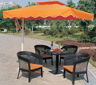
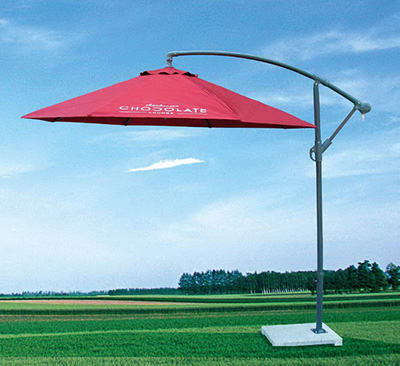
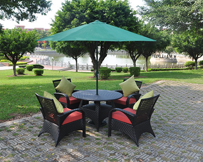
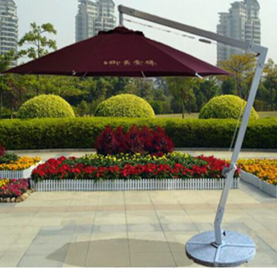
From dawn to dusk, the Patio Umbrella blocks the sun's glare as it moves across the sky. Crafted from the finest, highest-performing materials, the umbrella goes up easily with a pull of the cord and is held aloft by a sturdy cast-aluminum hub and pin system, and ribs. The canopy is tailored of premium, solution-dyed acrylic chosen for its extreme resistance to fading, staining, mildew, and mold. Available with an octagonal or square canopy, the umbrella performs beautifully in commercial settings or at your private residence with different marble or water base, or others design base for your selection.
Patio Umbrella contain:
side post square or round patio umbrella
central pole round or square patio umbrella
Single layer or double roof patio umbrella
Aluminum hanging umbrella


If you have any questions, please contact with us directly. Patio Umbrella are produced by Golden Eagle Outdoor Furniture With High Quality and Good Appearance. Welcome you can visit our Factory.For any inquiry,Please send mail directly to us.
Patio Umbrella
Patio Umbrella,Patio Sun Umbrella,Outdoor Patio Umbrella,Garden Patio Umbrella,Garden Umbrella
Golden Eagle Outdoor Furniture Co., LTD. , http://www.geoutdoor.com